Objectives
ASL Aviation Group is a leading global airline organisation. Based in Swords Dublin employing over 3,500 employees worldwide and offices in 13 countries with origins dating back to 1970. While very much a hidden B2B ASL see the value of investing resources into their digital footprint with more personalised approaches for varying user groups needed to be addressed globally. Each entity within the group needed to reflect harmony in overall brand architecture while demonstrating the merits of individual country operations, letting the Group flaunt its many attributes. The group goal was to have a modern website that catered to its broad target audiences. User engagement was a priority and ease of navigation was imperative.
Business Needs
ASL needed a website and tweaking of the brand identity that could represent them worldwide attracting new companies to their group, promoting global marketing and appeal to capital investors. The user base design requirements were broad and limitless and not an easy task to deliver. Dealing with multiple stakeholders from different countries within the organisation would be challenging too. Coordination of the workshops and processes would be conducted through online services such as MS Teams while using online design tools such as Figma to create the designs on the fly in each planned meeting. The deadline was to have the new site live with revised content before end October 2022 for a major investment opportunity giving 14 weeks for completion.
Purpose
The purpose of the website was to drive communications on behalf of the group to attract capital investment and primarily on board new clients such as Amazon. As the website is the only group marketing tool it was important for ASL to have something that differentiates them from their competitors. For CDG to manage these design requirements our expertise in Universal Design helped us create a framework that would work on a global scale. CDG applied the 7 Principals of Universal Design to manage the UI UX and make it intuitive to use while involving the browser visually with transitions and animations effectively along with colour and brand identity consistency.
Strategy
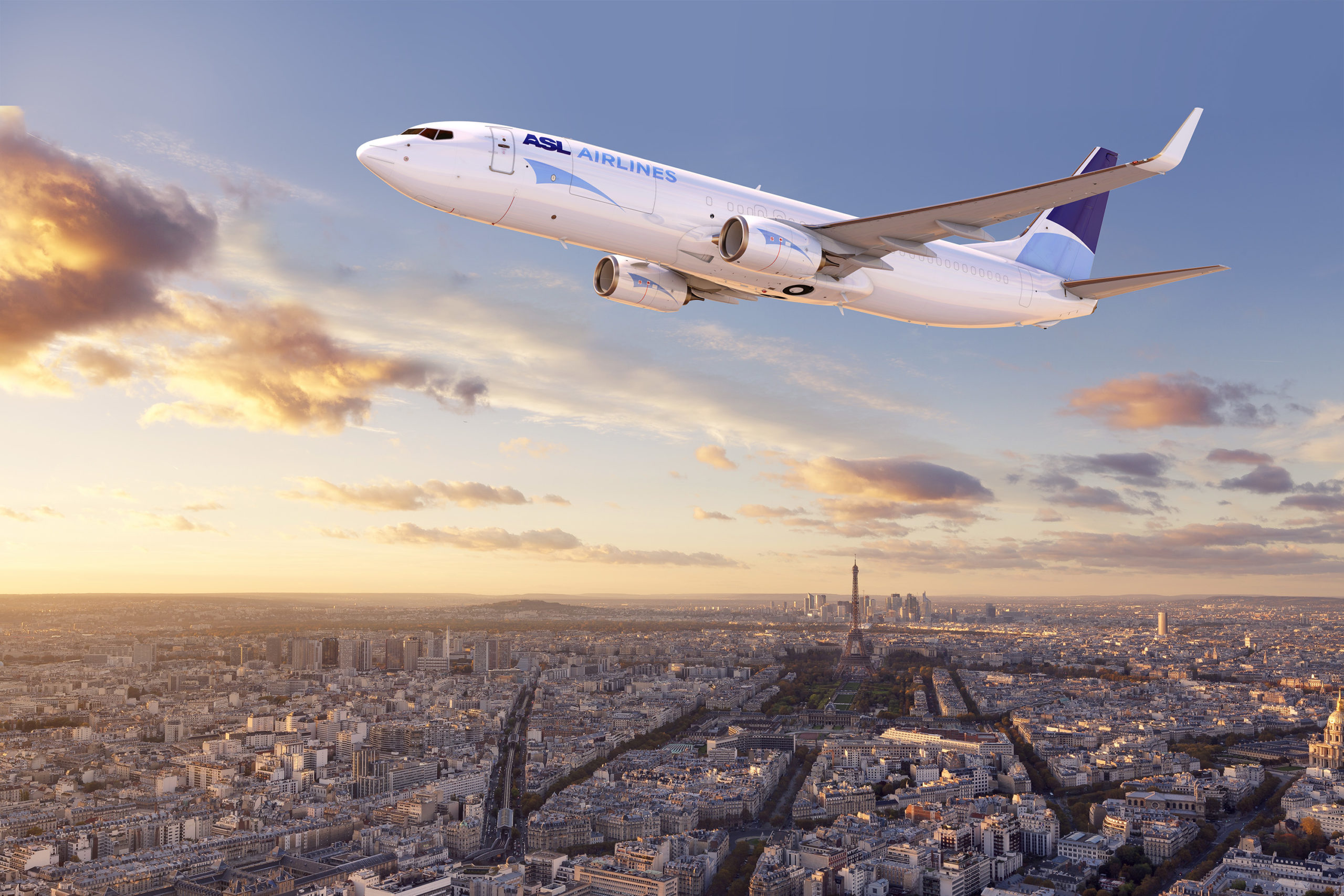
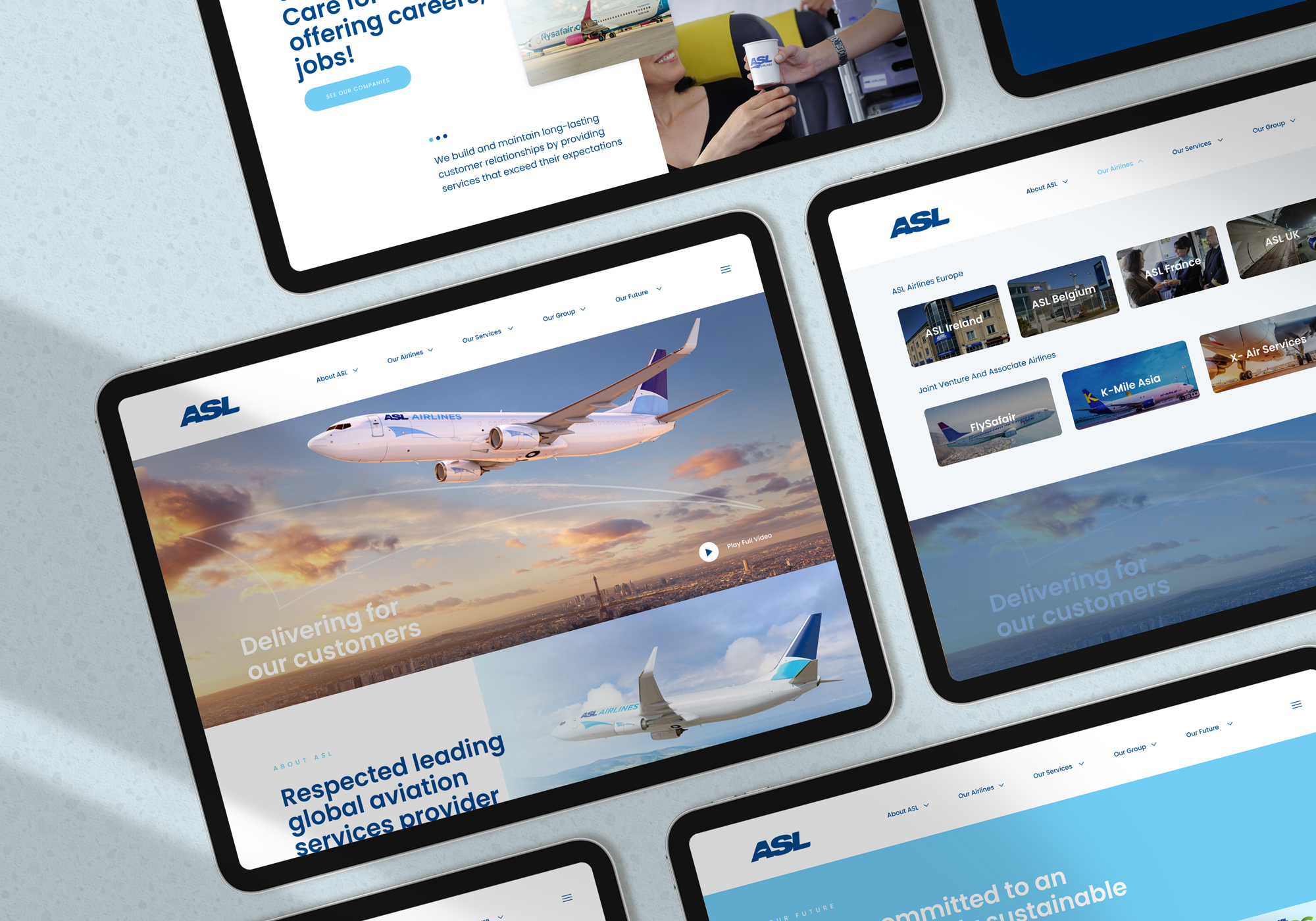
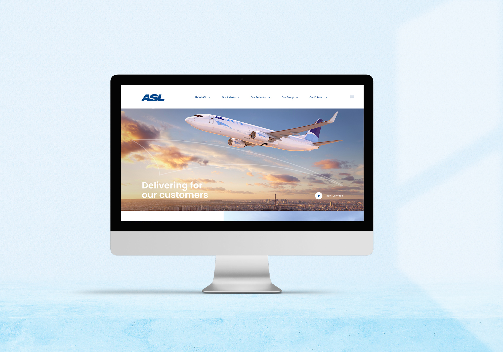
While we felt the content was so important the way the content was offered was even more important. Clear concise navigation was a priority but also telling the story of ASL which has a rich history is multi-faceted and a global entity would need a simple design to pull it all together. Each of the 9 airlines and the 4 sub brands needed to reflect the cor brand architecture while energising the group look and feel, exciting and modern. This would need to be achieved through photos of ASL planes in action with its staff through video CGI and stills. We were determined not to use stock photos so the story of ASL was told accurately through visual imagery. Therefore, creating a genuine brand presence for ASL group would be hugely important.
The digital website solution can only be truly effective by understanding and clarifying the goals of each airline within the group so all company aircraft and logos livery and tone of voice needed to be uniform, so we set this as a priority.
Creating brand consistency across these micro-sections is no small task but there are certainly ways to achieve uniformity across the board while allowing the 7 company personalities to shine.
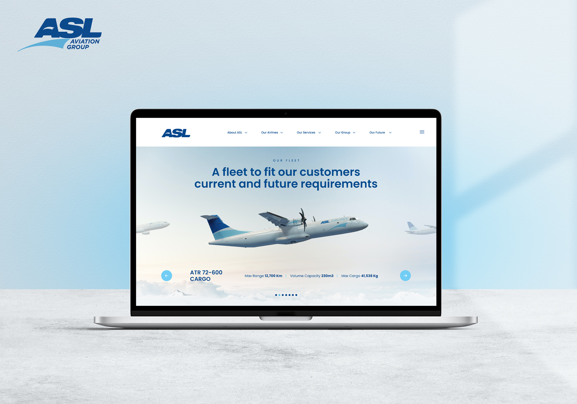
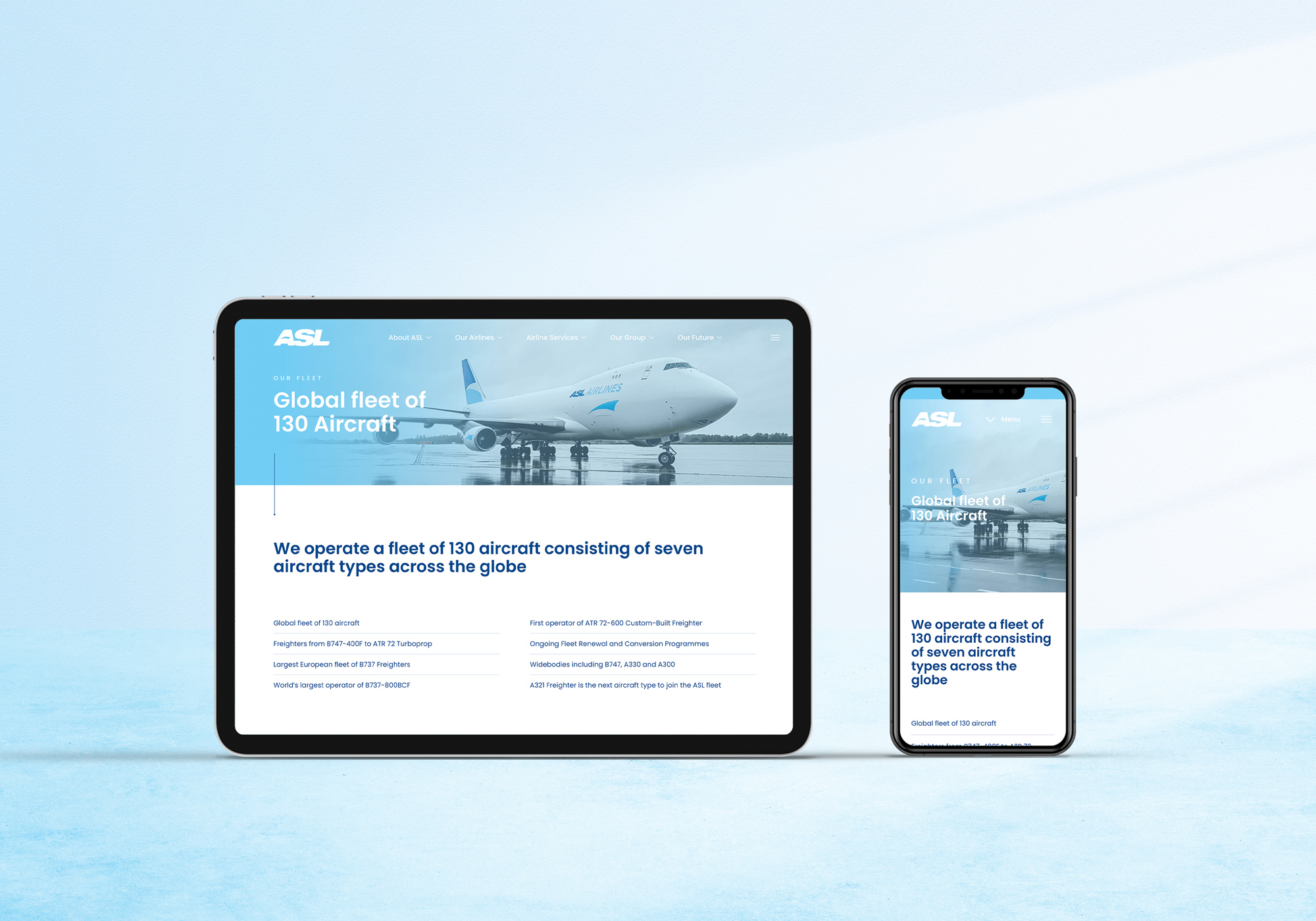
A unique page design framework for all company airlines would ensure design consistency across the board yet including each company stakeholder flexibility in use. At a basic level, selecting and maintaining a complementary colour palette throughout was the most effective way of aesthetically uniting different areas, while providing some level of flexibility to communicate the unique character of each airline. Similarly, consistency in font supporting brand recognition and uniformity in site design.
Design
We wanted to make the interface nearly invisible to the user, avoid unnecessary elements and be clear in the language we used on labels and in messaging. We used common elements in the UI to make users feel more comfortable getting things done quickly. We considered the spatial relationships between items on the page and structure the page based on importance. The careful placement of the items drew attention to the most important pieces of information. We used strategic use of colour and texture to direct attention toward or redirect attention away from items using colour, light, contrast, and texture. We used typography to create hierarchy and clarity and carefully considered how to use typefaces. We used different sizes, fonts, and arrangements of the text to help increase scan-ability, legibility, and readability.
Universal Design Principals
The Universal Design approach we incorporated was a two-level approach:
- User-Aware Design: pushing the boundaries of UI UX to include as many people as possible.
- Customisable Design: design to minimise the difficulties of adaptation to users.
Personalised
Personalising each Company Airline page with individual welcomes and photography was so important as each airline wanted to be represented accurately within its own rights.
UI design
We focused on anticipating what users might need to do and ensuring that the interface had elements that were easy to access, understand, and use to facilitate those actions. We brought together concepts from interaction design, visual design, and information architecture.
Visual as well as verbal
Providing warm visual meaningful imagery supporting the written content with tone of voice consistency was imperative. We created patterns in language, layout, and design throughout the site to help facilitate efficiency. Once a user learned how to do something, they could transfer that skill to other parts of the site.
Choosing Interface Elements
Users have become familiar with interface elements acting in a certain way, so we were consistent and predictable in our choices of layout to help with task completion, efficiency, and satisfaction.
We looked for elements that can help save space and not put more of a burden on the user mentally by forcing them to guess what is within the dropdown or what the element might be.
Input Controls: buttons, text fields, checkboxes, radio buttons, dropdown lists, list boxes, toggles, date field.
Navigational Components: sliders, search field, pagination, tags, icons.
Informational Components: tooltips, icons, progress bar, notifications, message boxes, modal windows.
Innovation and Technology
Our design innovation used was a blend of using Universal Design Principals, design thinking, computational thinking, maker culture, and business methods. We repeatedly used 4 main cycles which we call Gears of Design innovation. We believe the universal design in ASL is the Innovation and the Innovation is the design.
We insured the following:
- The design and composition can be accessed, understood, and used
- To the greatest possible extent
- Be in the most independent and natural manner possible
- Be in the widest possible range of situations
- No need for adaptation, modification, assistive devices, or specialised solutions, by any persons of any age or size or having any particular physical, sensory, mental health or intellectual ability or disability.
- Means, in relation to electronic systems, any electronics-based process of creating products, services, or systems so that they may be used by any person.
CDG followed and applied the 7 Principals of Universal Design.
Equitable Use – All age groups catered for.
Flexibility in Use – Easy navigation on all devices.
Simple and Intuitive Use – A new client has a low threshold for boredom
Perceptible Information – Great imagery used
Tolerance for Error – No page errors or problem links
Low Physical Effort – Easy to understand the core group structure
Size and Space for Approach and Use – Lots of best use of white space.
True innovation is usually a collection of many small innovative parts all coming together to give a better valuable experience. The innovative goal was to build a global website that would work in harmony with all airlines and countries that was more visually appealing and had unique story to tell.
We used WordPress and Elementor Pro for the technology and building of the design:
Visually build new pages and adapt header, footer, archive page, single posts, and all other parts of the site making the entire web design process visual and code-free which allowed them to complete new pages and tasks considerably faster than ever before.
We allowed ASL accessibility to build forms then connect them to any automation marketing platform or CRM in a few easy steps.
We created in the backend templates and blocks that integrated with widgets, so they could create pages featuring slides, animated headlines, forms, and other important page features.
The CMS was built to allow animated Headlines for impressive headline design, News posts, Slides, Media Carousel, and custom fonts.
Services Provided
- Brand Strategy
- Web Design & Development
- Maintenace
- Brand Collateral
- Digital Marketing
- Ecommerce
- Digital Advertising
- Stationery and Print Collateral
- Seo & PPC
